Giving VoiceConPH a voice of its own
Developing the brand identity for the second year of VoiceConPH, a conference exploring the power of storytelling.
- Client
- VoiceConPH
- My part
- Brand discovery, creative direction, visual system and guidelines
- Type
- Brand, events
- Year
- 2026
Why I took the project
In December 2025, Peter called me and asked if we could meet.
We hadn't spoken in about a year, so I was genuinely surprised. I've always looked up to him because of his creative background and experience running his own creative business. I was excited about working with him and having the opportunity to learn from his experience.
When we met, I asked, "How can I help you?"
He said he needed help branding an event for the following year. The conversation revolved around his vision of seeing the Philippines become a first-world country. The idea of contributing to that vision by helping Filipinos discover the power of their own voices was something I could get behind.
That event was the second edition of VoiceConPH.
Understanding what VoiceConPH needed
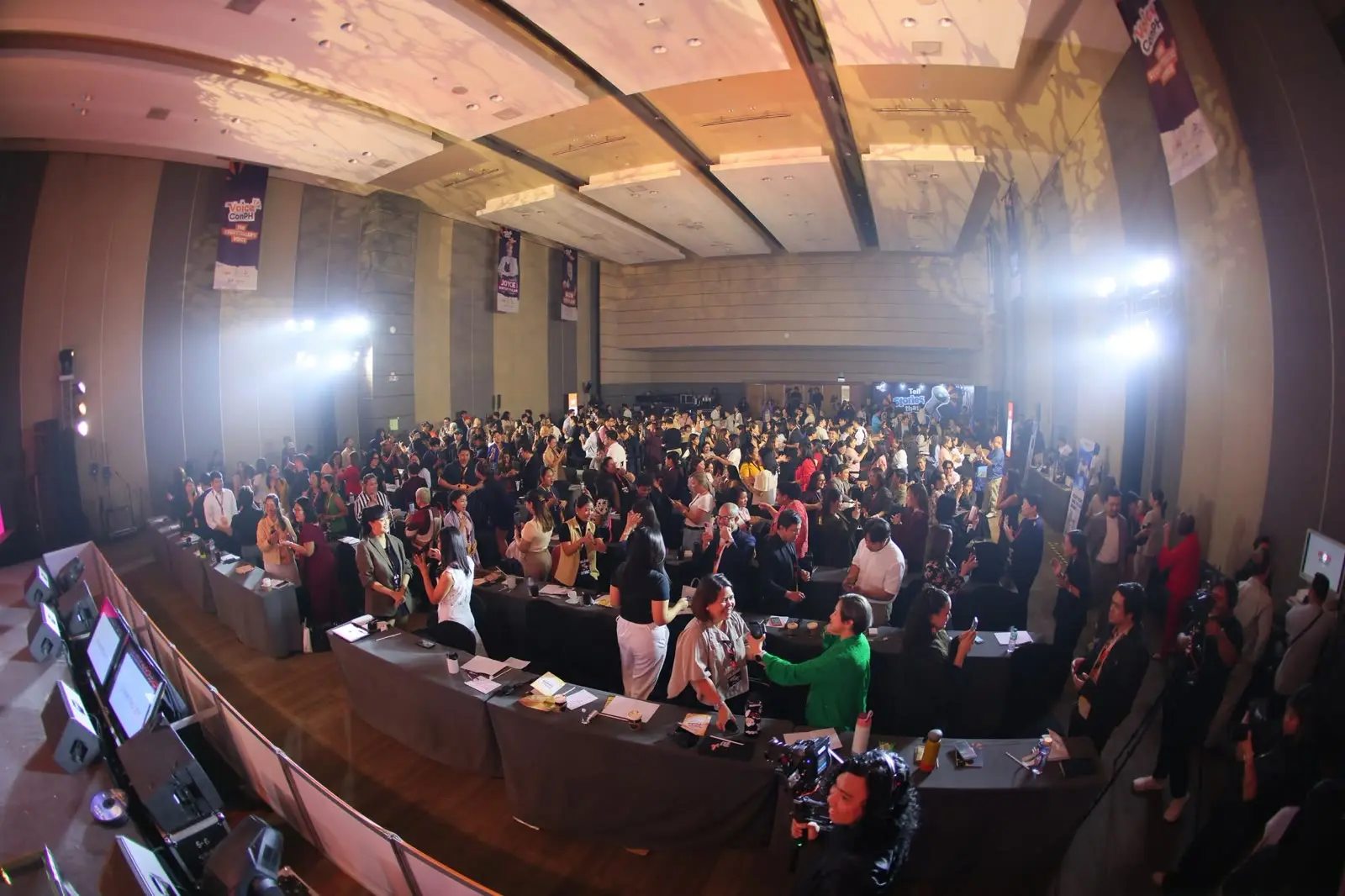
VoiceConPH had already attracted around 2,000 attendees in its first year. The founders had established an identity for the event and built a community around it.
As I looked through the existing branding, I became curious about how closely the identity reflected what the founders envisioned for VoiceConPH.
Much of the visual consistency during the first year relied on the person creating the materials. With more people becoming involved in the second year, I saw an opportunity to document the brand's foundations and develop a visual system that other creatives could work from.
To do that, I needed to spend some time with the founders.
Getting to know the people behind VoiceConPH
I prepared a set of questions and sent them to the founders before bringing everyone together for a brand discovery workshop.
During the session, I introduced the relationship between the personal and commercial sides of a brand. I described it as a swinging pendulum.
Leaning too heavily towards the personal side could make it difficult for an advocacy to sustain itself financially. Moving too far towards the commercial side could make people question the intentions of the business.
I wanted the founders to consider where VoiceConPH should sit between the two.
As we went through their answers, I began to understand how much of VoiceConPH came from their own experiences and beliefs.
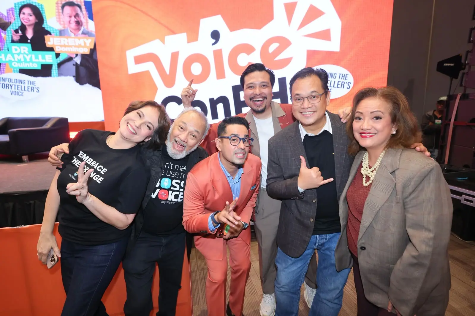
There was a sense of purpose and kindness in Peter's vision for the event. Ron brought a strong appreciation for integrity and authenticity, which complemented Joyce's belief in having the courage to use your voice. Brien brought a playful energy that I also wanted to capture in the brand.
What connected them was a belief that everyone had something worth saying. They wanted to create a space where people felt comfortable enough to explore what they could do with their voices.
One of the things the founders said during our conversations stayed with me: "Creativity is finding the beauty in the chaos."
That captured much of what I had come to understand about them.
Translating the conversations into visuals
After spending some time internalising everything from the discovery session, I felt like I understood what the founders were trying to say.
Now I wanted to see how I could communicate it visually.
This part of the creative process is difficult for me to explain. I imagine there are a few levers in my head that I adjust as I explore an idea. Somewhere in there is a library of visual references I've accumulated over the years, and I find myself drawing connections between them and what I understand about the project.
With storytelling being the theme of VoiceConPH that year, I became interested in the idea of leaving a mark.
It reminded me of the feeling of writing something in someone's yearbook and knowing they'll come across it again someday. There's something quite special about leaving a little piece of yourself somewhere for another person to discover.
I wanted the identity to evoke some of that feeling.
Exploring the visual direction
One of the directions we explored had a more editorial approach. We also experimented with large, expressive typography, which seemed like a natural visual association with voice.
I had seen similar approaches used across other conferences, and I felt there was room to give VoiceConPH a character of its own.
The founders had given me such a rich understanding of their personalities and the experience they wanted to create. I wanted more of that to come through in the design.
I began exploring the visual language of scrapbooks.
There's something inviting about opening someone's scrapbook and discovering what they've been working on. You can see where they've written down a thought or annotated a photograph, and through those details, you get a sense of the person behind it.
It felt appropriate for an event where people would be exploring their own stories and learning how to share them.
We developed stylescapes around this idea to help everyone envision how the direction could come together.
Giving the identity room to grow
We had around three months to prepare everything for the event. Establishing the brand direction had to happen within the first two weeks to give us enough time for production.
I brought in a small team of external designers for the visual execution and was curious to see what they could do with the direction we had established.
Working with a scrapbook-inspired visual language gave the team plenty of room to explore their own compositions. I wanted them to feel comfortable introducing ideas of their own while having a shared understanding of what we were trying to communicate.
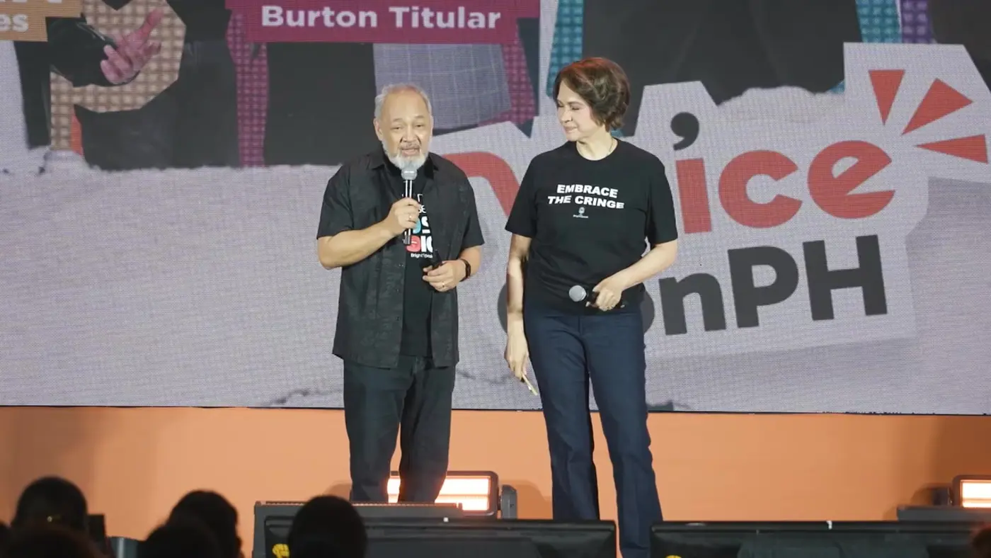
We could introduce handwritten annotations and paper textures alongside photographs of the speakers. The cutouts gave us a way to arrange information while retaining some of the spontaneity of an actual scrapbook.
My involvement throughout production was primarily in creative direction and reviewing the work. Whenever something needed adjusting, I could refer back to what we had established with the founders and consider whether the design was serving its intended purpose.
We documented the brand's foundations and visual system in a set of guidelines that other creatives could reference throughout the project.
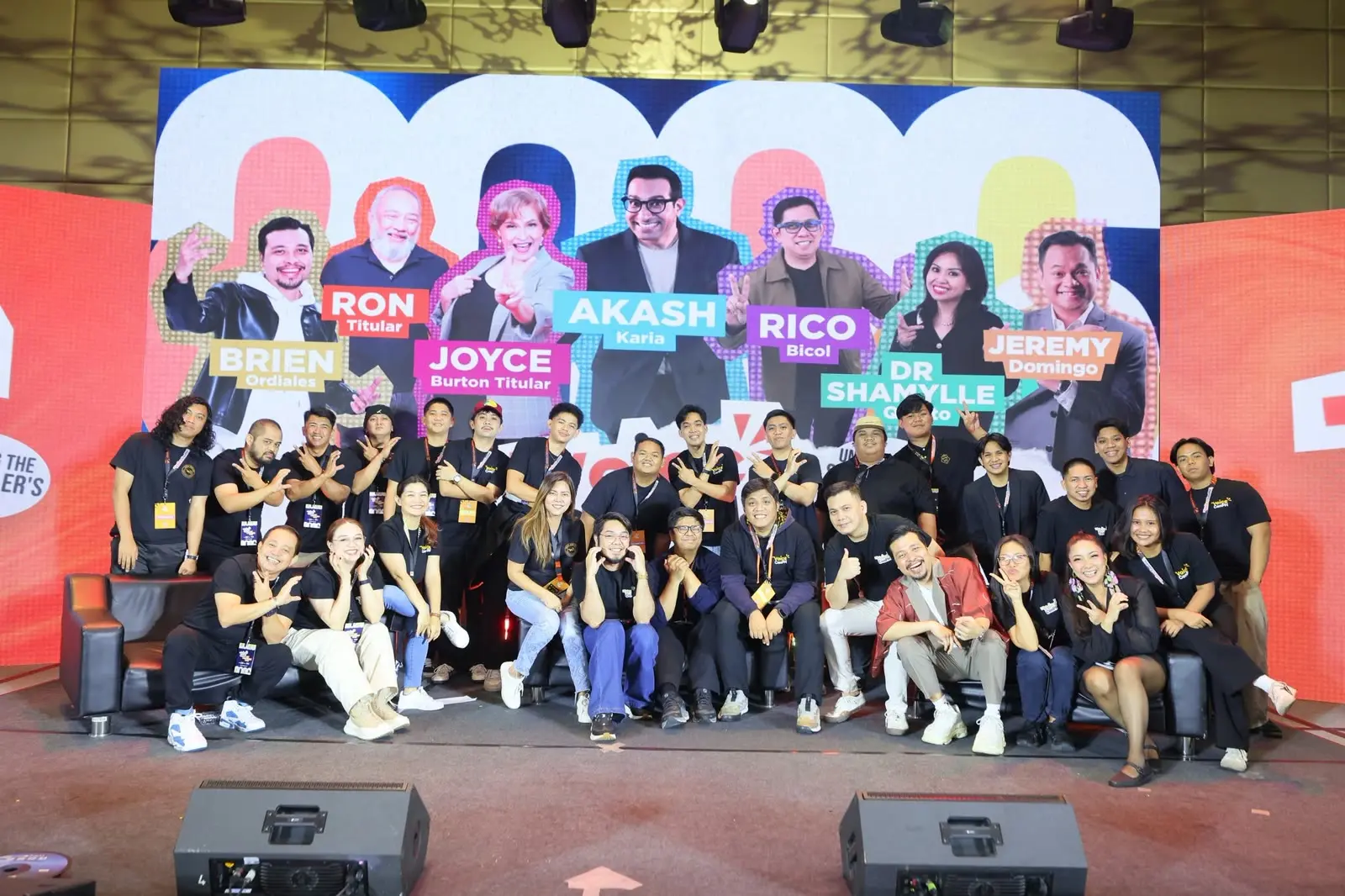
Over the following months, the identity found its way into speaker announcements, social media content, presentation materials and the sponsorship deck.
Seeing other designers work with the identity gave me a better appreciation for what goes into developing a visual system that other people can continue building upon.
Reflecting on the work
What I found particularly interesting about this project was how much of the creative direction came from understanding the people behind the brand.
I probably wouldn't have arrived at the scrapbook concept if I'd started by looking at how other speaking conferences presented themselves.
Getting to know the founders gave me a different understanding of what VoiceConPH could feel like. It also gave us something to return to whenever we needed to make a creative decision.
VoiceConPH was the first branding project I had taken on independently at this scale. My previous experience developing visual systems had largely been through agency and contractual work, where I was accustomed to figuring things out and executing much of the design myself.
Having other creatives involved meant I had to become better at communicating my ideas. I spent a considerable amount of time coordinating the work and making sure everyone had what they needed to move forward. It gave me a greater appreciation for the responsibilities that come with leading a creative project.
Looking back, I would have liked to spend more time speaking with the people who attended the first VoiceConPH. I spent a considerable amount of time understanding the founders, and I'm curious about what I could have discovered by hearing directly from the people who experienced the event.
It's something I'd like to explore further for VoiceConPH's third year.